New Look, Same Limitations: Intune’s Company Portal Facelift
Microsoft recently gave the Intune Company Portal app for Windows a visual refresh, but while the UI improvements are nice, they don’t solve some of the more pressing issues. If you were hoping for new functionality to make life easier for IT admins, you might be left wanting more. The updated design feels more modern and polished, but the lack of deeper functional updates leaves a few gaps—like the missing "retry" button for required apps and the absence of a quick way to gather logs.
What’s Changed?
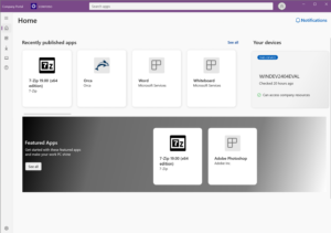
The new design for the Company Portal app focuses on improving the user experience through a cleaner interface.
Here’s what’s new:
- Updated Navigation: The navigation pane has been redesigned for easier access to apps, devices, and account settings. It’s sleeker and more intuitive, but the functionality remains largely the same.
- Enhanced Visuals for App Details: App descriptions, version numbers, and installation status are now presented more clearly, offering better readability and a more organized layout.
- UI Consistency Across Platforms: The updated Windows version now aligns more closely with the Company Portal app experience on iOS, Android, and macOS, creating a more unified look across platforms.

What’s Missing?
While the visual overhaul is appreciated, some important features are still absent:
- No "Retry" Button for Required Apps: For IT admins managing required apps, the lack of a "retry" option remains a frustrating oversight. If an app fails to install the first time around, users are left in a bit of a limbo, having to wait for another automatic attempt. A manual "retry" button would provide much-needed control in these situations.
- No Quick Way to Gather Logs: The updated interface still doesn’t include a fast, user-friendly way to collect logs for troubleshooting. Gathering logs is a crucial step for IT teams when diagnosing issues, and a quick method to do this directly within the Company Portal would save significant time and effort, especially when resolving support tickets.
- Better Application detection: If you've ever tried uninstalling an app through the Company Portal, you've probably encountered the issue where the uninstall button doesn’t show up right away or an app that has already been isntalled, has not been detected.It would be great to see improvements with detecting app statuses in real-time. While a fresh look is great, fixing these basic functionality issues would have been a much more impactful update.
Why This Matters
The updates to the Company Portal make the app look better, but for IT admins and organizations managing large device fleets, the functionality is what really matters. Without the ability to easily retry failed app installations or collect logs, the frustrations of managing devices remain.
Sure, the cleaner UI is a welcome change, but it’s the absence of deeper tools—like better error handling for app installs and streamlined troubleshooting—that keeps this update from being as impactful as it could be.
Wrapping It Up
Microsoft’s redesign of the Intune Company Portal app feels like a step in the right direction, but it’s mostly about looks. The missing "retry" button for required apps and the lack of a quick way to gather logs are still glaring omissions that make device management harder than it needs to be.
So while the fresh look is nice, it’s still a case of form over function. Hopefully, future updates will bring the essential tools that admins and users need to make their lives easier. Until then, it’s all about appreciating the superficial improvements while managing the same old challenges.